MICHAEL FEENEY
Art Direction and Branding


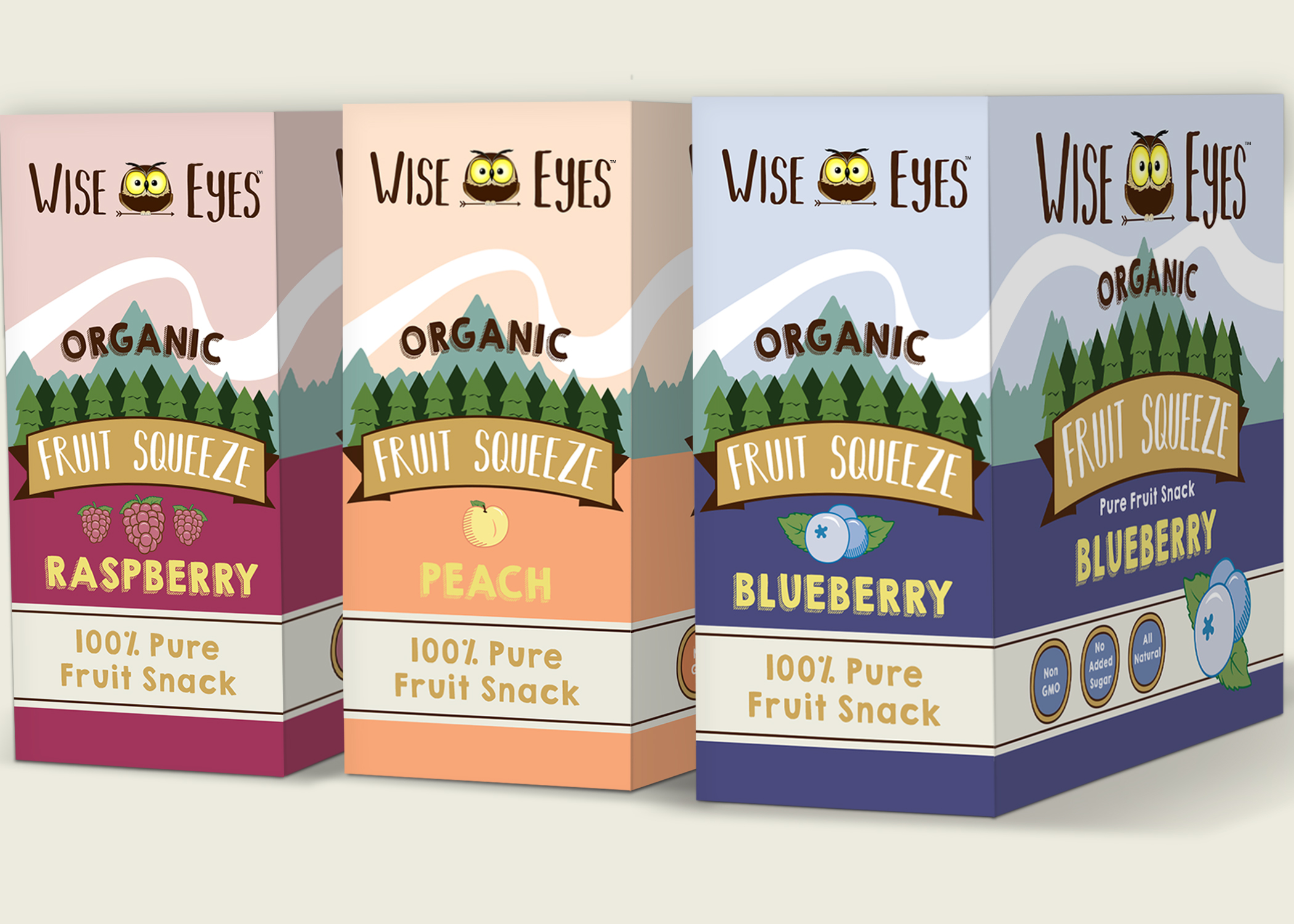


Role: Art Direction and Design
Brief: A newly birthed fruit squeeze company called Wise Eyes has emerged; thus requires a complete visual identity and branding effort to establish themselves on the market. The brand concept is to be built around a fun loving outdoors theme, focusing on the “wise” owl as the brand’s trade mark.
Solution: A winning earth tone color scheme in combination with playful organic fonts brings this brand to life. This joined together with the bright glow of the Wise Eyes Owl makes for a modern look that won’t be missed! A colorful forest themed illustrated package/box design completes this charming brand! Live a life that excites you, Wise Eyes will keep you full on the go!